Hennessy V.S.O.P New Bottle Design
Legends are shaped over time…
The tale of Hennessy V.S.O.P. began on 7 October 1817, when the future King George IV of England asked the great French cognac House to supply him a very special cognac that described as “Very Superior Old Pale”…
This cognac’s personality has gone unchanged for nearly two centuries. Under the stewardship of Hennessy’s cellar master, the Tasting Committee hands down the secrets of selection, ageing and blending, as can be seen in the use, for maturation, of oak barrels that have lost part of their tannin, so as to avoid giving the eau de vie excessively woody notes while providing an elegant expression.
The pale coloured cognac has got a natural balance of strength and smoothness; spiced with vanilla, clove and cinnamon, and a toasted note arose from the maturation in oak barrels; which is a long lasting one on the palate.
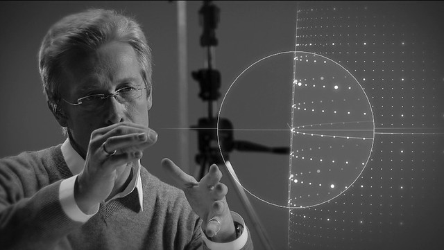
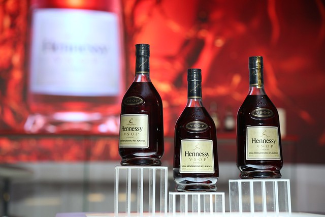
And so, such an iconic cognac should be presented in a bottle whose curves signify the elegance and generosity of its content, as well as its balance and exceptional harmony. The famous designer – Chris Bangle has been tasked with moving the design of the Hennessy V.S.O.P. bottle forward.
Chris Bangle is an American automobile designer known for his daring design and far-reaching influence. Bangle is known best for his work as Chief of Design for BMW Group, where he was responsible for the BMW, MINI and Rolls-Royce motor cars from 1992 to 2006.
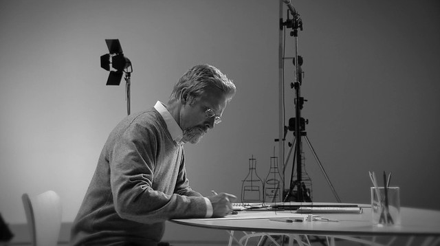
The Hennessy V.S.O.P new carafe is his first masterpiece outside the automobile industry. For Hennessy V.S.O.P., the designer first sought to identify the cognac’s personality by delving into its history.
For him, a product cannot be summed up by a function or an aesthetic: a product is living thing.
“Designing for Hennessy gave me the same sensations as working on designs for fast BMWs or a great Rolls Royce. It is that experience of a unique emotion.”
The Key Changes on Hennessy V.S.O.P. Bottle Design
• Slightly accentuated the curve in the side of the bottle, reinforcing the dynamic of its silhouette (by less than 1 millimetre).
• Inspired by the Hennessy V.S.O.P. bottle created in 1954, Chris Bangle chose to confirm this upward movement with a thicker base resembling a pedestal to distinguish the whole and stabilise it.

• Added a hollow bottom to the bottle to adapt it for handling.
• Lengthened the bottle’s neck and straightened its shoulders, stretching it vertically.
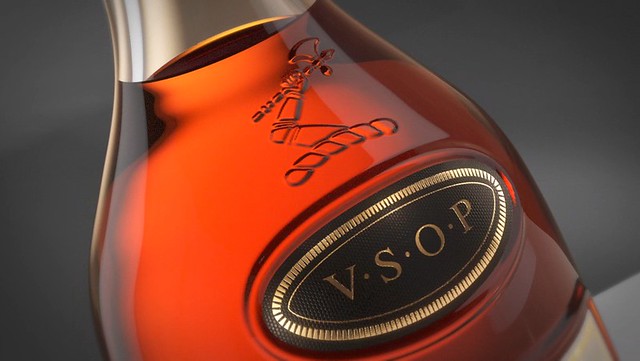
• Drew two lines of perspectives in the glass around the central label, creating an optical effect by structuring the front of the bottle with a pyramid perspective (a reminder of the notion of uplift, dear to V.S.O.P.) Actually, this geometry attracts one’s regard toward the top of the bottle, where Chris Bangle chose to engrave the legendary arm and axe of the Hennessy family into the glass itself.
• Revised the choice of paper and colours for the labels: a few millimetres from the arm and axe, the symbolic Hennessy V.S.O.P. oval is coloured in a dark grey ennobled with golden embossing, a reminder of the alchemy of contrasts comprising it. The main label highlights this refinement with a shimmering gloss imprinted with clusters of grapes and vine leaves in the background as a subliminal reminder of the origins of the cognac contained in the bottle.
The Key Changes on Hennessy V.S.O.P. Box Design
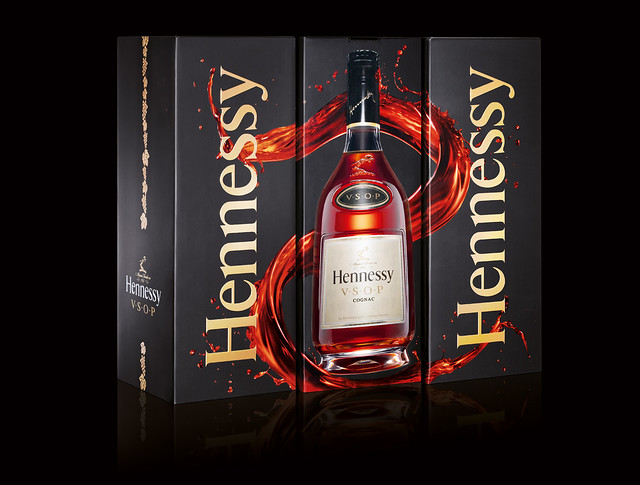
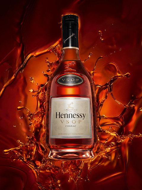
• The box that the bottle comes in has also benefited from this renewal, giving its edges over to a more modern vision: the sides have been refined so that all we see is the bottle, dramatised by photographer Adam Savitch.
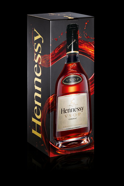
• The “Superior” quality of the cognac is evoked by the liquid splash of V.S.O.P. on the back of the bottle, a reminder of the curves of an “S”.
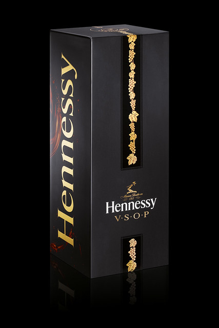
• Lastly, one side of the box, called “Black Tie”, glorifies elegant purity on a black background decorated with a band of golden vine leaves, echoing the bottle’s label. This band is part of the heritage of the Hennessy V.S.O.P. box created in 1954, where it appeared in a red and gold version.
The Key Changes of Hennessy V.S.O.P. Security Features
• A laser stamp for the 35-cl, 70-cl and 3-litre bottles and a hologram of increased complexity (now with new horizontal lines forming a grape cluster) seal the cap. The “Superior” quality of the cognac is evoked by the liquid splash of V.S.O.P. on the back of the bottle, a reminder of the curves of an “S”.
For more information on this new bottle and upcoming events, feel free to log on to:
www.facebook.com/HennessyMalaysia & LIKE their page
For their event launch, view Here.
wow, that’s a lot of scientific research and hard work put into the bottle’s design! and it still looks very stylish and sophisticated 😀